DANNIELLE TARLINTON

DOWNLIGHT
INDIVIDUAL PROJECT
To design marketing campaign including a logo and rhetoric images for a new bar.
10 WEEKS
BACKGROUND
A theoretical inner city retail precinct is currently under development. The stores were new and contemporary, with a fashion forward and cutting edge design style. One of these new stores would be a bar. This bar requires marketing materials such as a logo, social media presence, and advertisements to inform the public of the new place to go.

DEMOGRAPHIC
The target user would be aged between 25 - 45 years of age. A professional either living or working in or near the city. On a Friday afternoon or on the weekend, they just want somewhere comfortable and interesting to socialise and have a good time. The user would enjoy a few drinks. They are always looking for new places and new experiences around the city to share with their friends and colleagues.

MOODBOARD
KEY WORDS
Contemporary
Industrial
Urban
Minimalistic
Sophisticated
Iconic
Cutting Edge
CONTEXT
Alcohol Bottles
Glassware
Various types of lighting
Variety of seating options and areas
People socialising and drinking
Bar tenders
Style (Modern, Industrial, rustic)
Urban Location


LOGO DESIGN

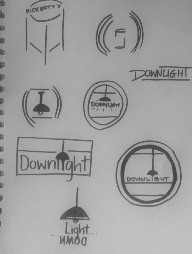
These logos inspired the design for the one created for the ‘Downlight’ bar. These logos are minimalistic, only using black and white line work to create unique shapes to draw the eye and develop a brand identity. Below are the sketches of various logo design concepts. The also feature minimalistic black and white line work. The use element of the style of bar to create the design.
SKETCHING DESIGNS


CHOSEN DESIGN

ITERATIONS


LOGO MOCK-UPS


IMAGE DESIGN


For the Downlight Bar, I was required to design and present final artwork for a series of at least three related campaign images. The logo design developed the brand’s identity. Using the logo and images for inspiration, rhetorical images were produced.
The style of images created were inspired by a variety of posters, artworks and advertisements. The first inspiration was the posters of the 1920s that had a more graphical style, using black and heavy colour saturation to create dynamic posters. The second was Henri de Toulouse LauTrec, a late 1800’s artist who created posters for the Moulin Rouge. He often used a person as the central figure of his artwork along with large areas of black to add contrast.
The third inspiration was horror movie posters from the 1920’s. They used bold and vibrant colours alongside a more illustrative. They tend to play well with light and shadow to create depth. The fourth inspiration were alcohol advertising images from the 1920s These posters often used provocative imagery, promoting alcohol as scandalous.
SKETCHING THE IMAGES


IMAGE ONE: INSTAGRAM


IMAGE TWO: POSTER


IMAGE THREE: MAGAZINE


PROJECT REFLECTION
To accompany my studies as an industrial design student I chose to do graphic design. This project highlights a project I really enjoyed undertaking. The experience of designing a logo and images helped me to design these marketing material for my industrial design projects. It was fun to be creative and show a sense of my personal style when designing these materials.